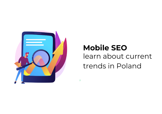
- Mobile Internet Usage in Poland
- Internet and Connectivity Trends
- Mobile Search Behavior Trends in Poland
- Local and “Near Me” Searches
- Mobile Queries vs. Desktop Queries
- Effective Mobile SEO Strategies
- Page Speed and Performance
- Optimized Content and Metadata
- Structured Data and Rich Snippets
- Local SEO for Mobile Users
- Local Mobile Search and Polish SEO Specifics
- Google’s Dominance in Poland
- Market and Cultural Context
- Emerging Mobile Search Trends
- Visual Search and AR
- Mobile Commerce and Shopping
- Common Mobile SEO Pitfalls
- Content Mistakes
In recent years, Poland has followed the global shift toward mobile internet. Mobile devices now dominate how Polish users search and browse online. This means that optimizing for smartphone users is no longer optional for websites targeting the Polish market. For example, more Polish internet queries now come from phones than desktops. A site that isn’t mobile-friendly might be effectively invisible to many users. For beginners and seasoned marketers alike, understanding the trends in mobile search behavior in Poland can unlock new opportunities and improve visibility. This article explores current mobile search trends in Poland and shows why optimizing for mobile is essential for SEO success in the Polish market.
Mobile Internet Usage in Poland
Poland boasts a high smartphone adoption rate. In early 2025, there were roughly 54 million mobile connections in Poland – about 140% of the total population. Many people carry more than one mobile device or SIM card. With so many mobile connections, a very large portion of the population goes online via smartphones and tablets. In fact, studies indicate that around 60–70% of Polish web traffic comes from mobile devices. In practice, this means the majority of online searches and browsing happens on mobile screens.
Polish internet users are often on the move: they check news, shop, navigate, and communicate using their phones. Younger generations especially rely almost entirely on mobile for everyday tasks. Even older adults in Poland now use smartphones for things like banking and social media. As a result, websites not optimized for small screens risk losing a large share of visitors. For example, if a local store’s site isn’t mobile-friendly, a hungry customer might click away before finding its address. Responsive design, large buttons, and clear menus all help keep users on the site. In short, treating the phone as the primary device has become standard in Poland, so a mobile-first approach is key.
Polish users often multitask with their devices. They might use their phone on a bus or train to find deals or read reviews while standing in a store. Since high-speed mobile internet is widespread, even rural users stay connected. Many mobile plans include unlimited data, so people stream videos or use maps without worrying about extra costs. This connectivity means websites can safely include multimedia elements, but it also raises the bar for speed and stability. A slow-loading site will frustrate users on any device. Tools like Google’s PageSpeed Insights or Lighthouse can simulate mobile network conditions and help fix speed bottlenecks. Remember, even an extra second of load time can significantly increase the chance of a mobile visitor leaving the page.
According to Google’s data and industry reports, the majority of web traffic in Poland now comes from mobile devices, especially in cities. In big urban areas like Warsaw and Kraków, almost everyone under 50 owns a smartphone, and many households use phones as their main internet access point. In fact, more Polish internet queries originate from mobile devices than from desktop computers. It’s no longer an option to treat mobile as secondary. Polish websites that look good and function well on any device will naturally rank higher in search results.
Internet and Connectivity Trends
Poland’s mobile network infrastructure has improved rapidly. 4G coverage now reaches almost all populated areas, and 5G networks are rolling out in major cities. Faster connections mean users expect rich content on their phones: high-resolution images, video, and interactive features. Yet many Poles still live outside city centers. Even there, 4G provides decent speeds, but some connections can be slower. That’s why optimizing page speed and minimizing load size is vital. Compressing images, enabling browser caching, and minimizing unnecessary code help pages load quickly. Employing lazy-loading for off-screen images ensures that only visible content loads first.
Mobile internet penetration in Poland is nearly 90%. Almost everyone of working age is online. As more people switch to mobile for both search and shopping, even small-town businesses must have a strong mobile presence. Industry studies note that Polish users often combine mobile usage with other activities: for example, using their phone in a car or on a tram to find deals or scanning product barcodes in a shop to compare prices. Because of this, websites need to perform well under varying conditions.
In the Polish market, performance can set a site apart. Make sure to test your pages with tools like Google PageSpeed Insights or Lighthouse under mobile network conditions. A site that loads in 3 seconds or less on a typical 4G connection will keep Polish users happy. Even a one-second improvement in load time can boost engagement. Simple steps, like choosing a lightweight theme or cleaning up bulky code, can make a big difference. Fast, smooth performance on mobile not only keeps visitors longer but also signals to Google that your site provides a good user experience.
Mobile Search Behavior Trends in Poland
Voice search is on the rise in Poland, mirroring a global trend. More Poles are asking their phones questions out loud instead of typing. Voice queries use natural, conversational language. For example, someone might say: “Jaka będzie pogoda dzisiaj w Warszawie?” (What’s the weather today in Warsaw?) or “Jak dojechać pociągiem z Krakowa do Poznania?” (How to get from Kraków to Poznań by train?). Polish voice searches often include polite or casual phrasing, so using synonyms and informal expressions in content can help.
Optimizing for voice search means anticipating these conversational questions and providing concise answers. Structuring your content with clear question-and-answer pairs is key. For instance, use headings or an FAQ format with question words (like “Jak…?” or “Gdzie…?”). If a user asks their voice assistant a question, Google Assistant or Siri might read the answer from the top result. Using FAQ or HowTo markup can increase the chance that assistants choose your text. For example, a cooking site could mark up step-by-step recipes (HowTo schema). Then if someone asks “jak ugotować jajka na twardo?” (how to boil hard-boiled eggs), Google Assistant might read your steps aloud.
In summary, focus on real questions and concise answers. Polish voice queries often start with “jak” (how), “gdzie” (where), “co” (what), or “czy” (whether), and they may include place names or local terms. Ensuring your content includes those natural phrases – and marking up FAQs – improves the chance of your site appearing in spoken answers.
Local and “Near Me” Searches
When Polish users search on mobile, many queries have local intent. Typical examples include “pizza koło mnie” (pizza near me), “apteka otwarta Wrocław” (pharmacy open in Wrocław), or “kawiarnia Kraków rynek” (coffee shop Krakow market square). Mobile devices use GPS and network data to return geographically relevant results. This makes local SEO extremely important.
For local businesses, a complete Google Business Profile (with accurate address, hours, photos, and customer reviews) is essential. On smartphones, Google often displays a map snippet or “Local Pack” at the top of results for local queries. If your business appears there, a user can tap to call or get directions immediately. Optimizing your listing can therefore drive significant foot traffic. Encourage satisfied customers to leave positive reviews, since high ratings improve your placement in local results.
Local language and place names also matter. Many Polish searches include city or neighborhood names. For example, someone might search “dentysta Poznań Jeżyce” (dentist Poznań Jeżyce). Including these geographic terms naturally in page content and titles improves relevance. Additionally, mobile voice searches might include phrases like “koło mnie” (near me) or “najbliższy” (nearest). Using natural language and local terms helps ensure your site matches these queries.
On your website, include a clear contact page with a map and directions. If you have multiple locations, create separate pages or listings for each. For example, if you have stores in Warsaw and Poznań, have separate pages and Google listings for each city. Use clear headings and content specifying each location so local users find the nearest branch. Ensure your Name-Address-Phone (NAP) info is consistent across all pages and directories. Polish mobile users often look for phone numbers or addresses first; make these clickable (call or map links) on mobile devices.
In summary, mobile search in Poland often has a strong local intent. Optimizing for proximity means emphasizing local terms, Polish place names, and up-to-date business info. This approach will help your site appear in map packs and “near me” queries, capturing on-the-go users looking for nearby services.
Mobile Queries vs. Desktop Queries
Mobile and desktop searches sometimes have different patterns. On mobile, users often seek quick answers, directions, or immediate solutions. Desktop users might do more in-depth research or longer browsing sessions. In Poland, as elsewhere, many people first see something on their phone and then investigate further on a computer (or vice versa). However, often the very first contact happens on mobile – for example, someone might ask their phone for the nearest gas station while driving, then plan the rest of the trip at home on a desktop.
Because mobile searches often reflect “micro-moments,” content should cater to quick needs. That means placing important information at the top of mobile pages. For example, include a prominent summary, a bullet list of key details, or visible contact info right away. If your site is about a restaurant, show cuisine type and phone number at the top; if it’s an article, start with a brief overview.
Mobile queries are often shorter and more task-focused when typed (but longer when spoken). A user might type “PKP bilet Kraków Poznań” instead of a full sentence. Content for mobile audiences should provide answers quickly and clearly at the top, while also matching the terms people use. For instance, a recipe page could list ingredients and cooking time in a brief bullet list at the start, then describe the process below.
Another difference is session length: mobile sessions tend to be shorter, but with more immediate clicks (calls, clicks to maps, or purchasing). Desktop sessions can allow more scrolling or comparison shopping. Knowing this, you can tailor your SEO: make mobile pages scannable and action-oriented (clear headers, quick answers, easy-to-click buttons), while desktop pages can include more detail or extended content as appropriate.
Effective Mobile SEO Strategies
A mobile-friendly website is the foundation of mobile SEO. This usually means a responsive design that automatically adjusts layout for any screen size. Text should be large enough to read without zooming, and links or buttons should be easy to tap with a finger. Google’s algorithms explicitly favor mobile-friendly sites for mobile queries. In fact, since 2019, Google uses mobile-first indexing, which means it primarily views the mobile version of a site to determine rankings. In practice, this means if your site looks good and works well on smartphones, it will likely rank better overall. Sites that are only desktop-friendly may perform worse. A well-designed mobile site builds trust with both users and search engines.
Important aspects of a mobile-friendly site often include:
- Responsive layouts that adapt to any screen width.
- Large, readable text and clear contrast for easy reading on small screens.
- Simplified navigation with touch-friendly menus and buttons (like a hamburger menu).
- Minimal pop-ups or ads that block content on phones.
- Optimized images and media that resize automatically.
For example, hamburger menus or simple icons help users find content without excessive scrolling. Removing large pop-ups is also crucial (Google may penalize mobile sites with intrusive ads). Keep in mind the “thumb zone” – mobile users find it easiest to tap buttons near the edges of the screen, especially the bottom corners. Placing important buttons or menus within easy thumb reach can significantly improve usability. In short, a clean layout and easy navigation tailored for touchscreens will keep mobile visitors happy. This not only boosts user engagement (lower bounce rates, longer visits) but may also help SEO, as Google measures those metrics for ranking signals.
Page Speed and Performance
Polish mobile users expect fast loading times. A slow site can frustrate visitors and make them leave immediately. Search engines know this and incorporate page speed into rankings. Key metrics include how quickly the main content loads (Largest Contentful Paint) and how responsive the page is (First Input Delay). These are part of Google’s Core Web Vitals, which strongly influence mobile search results.
For example, if a page has a large photo, resizing and compressing that photo can cut loading time dramatically. Minifying code (removing unnecessary spaces and comments from HTML/CSS/JS) and deferring scripts ensures the site becomes usable faster. Lazy loading images (loading them only when they scroll into view) also speeds up the initial render. Above all, prioritize above-the-fold content so users see something immediately.
To improve mobile performance, common methods include:
- Image Optimization: Compress and use modern formats (WebP/AVIF) to reduce file size.
- Minification: Remove unused code and compress HTML, CSS, and JavaScript.
- Caching & CDNs: Enable browser caching and use Content Delivery Networks to serve files quickly to users across Poland.
- Lazy Loading: Defer off-screen images and scripts until needed.
Additionally, consider advanced techniques: for content sites, Google’s AMP (Accelerated Mobile Pages) can serve lightning-fast versions of your pages. AMP pages are cached by Google and load almost instantly, sometimes with special placement in results. Alternatively, building a Progressive Web App (PWA) offers app-like features (offline access, push notifications) to mobile visitors. A well-built PWA can boost user engagement, which search engines notice through longer sessions.
In the competitive Polish market, performance can set a site apart. Use Google’s Lighthouse or PageSpeed Insights under mobile network conditions to pinpoint issues. Even simple steps like reducing font variants or cleaning up bulky themes can improve scores. With faster pages, visitors stay longer – and search engines reward your site with better visibility.
Optimized Content and Metadata
Content should be tailored for mobile readers. On small screens, lengthy blocks of text are hard to read. Break content into short paragraphs, and use bullet points or numbered lists to highlight key ideas. Use descriptive headings (H2, H3) to help readers and search engines navigate. From an SEO perspective, include relevant keywords naturally. Many Poles search using question words like “jak” (how), “gdzie” (where), and “najlepszy” (best), especially on mobile. This means your content should anticipate common queries.
For example, consider adding FAQ sections that start with question words. Phrasing headings as questions and answering them concisely can be effective. When a user searches on mobile, they often want quick definitions, guides, or step-by-step instructions. Structuring content with clear Q&A or bullet points makes it easy for both users and search engines to find answers quickly. It also increases the chance your content is shown as a featured snippet or read aloud by voice assistants.
Remember to make your content unique and helpful. Polish users value relevant, localized information. Include details a local searcher would find valuable, such as nearby landmarks, district names, or prices in złoty. This not only helps SEO but also builds trust. For example, if you’re writing about restaurants, mention nearby attractions or typical local dishes. Also use mobile-first content features: callout boxes or bullet lists that highlight important points. The goal is to make key information obvious at a glance on a phone screen.
Keep SEO metadata concise too: mobile SERPs often truncate long titles and descriptions. Aim for brief page titles (around 50 characters) and meta descriptions (around 150 characters), placing important keywords at the start. For instance, if your title is “Najlepsze Pizzerie w Warszawie – Opinie i Ceny” (Best pizzerias in Warsaw – Reviews and Prices), ensure “Warszawie” appears early. This makes your snippet more readable and compelling on small screens.
Structured Data and Rich Snippets
Structured Data markup (such as Schema.org formats) helps search engines understand your content and can make your site eligible for rich results on mobile. For example, marking up FAQ sections, how-to guides, product details, or reviews can lead Google to show special formats or answer boxes. On mobile screens, these rich snippets stand out and can improve click-through rates.
For instance, if someone asks “jak ugotować jajka na twardo” (how to boil hard-boiled eggs), a well-marked-up answer with steps could be read aloud by Google Assistant. Similarly, marking up product pages allows Google to display price, availability, and ratings directly in the snippet, which catches shoppers’ eyes. Structured data is an advanced technique, but it gives you an edge; Google explicitly encourages its use and provides tools to test your markup.
Use schema wherever relevant: Product schema on product pages (with price, brand, etc.), Event schema for local events, FAQ schema for common questions, and HowTo schema for tutorials. If you have a Q&A section or forum, QAPage markup can help Google surface those answers. These structured cues make it easier for Google to present your content in rich, mobile-friendly formats, which can boost visibility.
Local SEO for Mobile Users
Local search is a big part of mobile behavior in Poland. Ensure your Google Business Profile is optimized: add an accurate address, phone number, hours, and photos. Encourage satisfied customers to leave positive reviews, as higher ratings can lead to better placement in local search results. On your website, include a clear contact page with a map and any location-specific pages if you have multiple branches. This makes it easy for mobile searchers to find and contact you.
Use local keywords naturally: for example, “najlepsza restauracja Kraków” (best restaurant in Kraków) or “sklep komputerowy w Poznaniu” (computer shop in Poznań). Include city and neighborhood names in your content where relevant. For example, if you have multiple store locations (e.g. Warsaw and Poznań), create separate pages or Google listings for each. Use clear headings and content specifying each city so local users find the right information.
Also ensure your NAP (Name, Address, Phone) info is consistent across all pages and directories. Poles frequently make on-the-spot decisions on mobile, so having your phone number and address visible and clickable can drastically improve conversions. By focusing on local optimization – accurate listings, local content, and reviews – you can dramatically improve your visibility in mobile search results for Polish users.
Local Mobile Search and Polish SEO Specifics
Polish presents unique SEO challenges. It uses many grammatical cases and special letters (ą, ć, ę, ł, ń, ó, ś, ź, ż). Mobile users might search with or without these accents (for example, “zabka” vs “żabka”). Search engines handle both, but using correct Polish spelling in your content signals quality. Include common synonyms and variations naturally. For example, some users might search “narzędzia sklep” while others say “sklep narzędziowy.” Cover these variants in your text.
Polish queries often come in full questions or conversational phrases, especially via voice. Using question words like “co”, “gdzie”, “jak”, or “czy” in headings or content can help capture these queries. At the same time, avoid awkward keyword stuffing. Write in a clear, conversational style as if speaking to a user. If you’re unsure about phrasing, think of the question a person might ask their phone. Reflecting actual search behavior in your language will make the content more relevant to Polish users.
For example, instead of a generic title like “Zakupy Online”, use a question format like “Jak zrobić zakupy online w Polsce?” if that matches user queries. Ensure all interface text (buttons, menus) is in Polish as well, so mobile users feel at home.
Google’s Dominance in Poland
In Poland, Google overwhelmingly dominates search (over 95% share of web and around 98% of mobile search). For SEO, this means it makes sense to follow Google’s guidelines closely. Google rewards mobile-friendly content and penalizes sites with poor mobile experiences. For example, ensure your site uses HTTPS (Google gives a slight ranking boost to secure sites) and includes a mobile sitemap if needed. Also avoid intrusive interstitials: Google may downrank pages that use annoying pop-ups on smartphones.
Since almost everyone uses Google on mobile, focusing on other search engines (like Bing) is less critical here. It’s more important to meet Google’s standards: fast load times, secure HTTPS, and a responsive layout. Take advantage of Google’s tools: Search Console can show mobile usability issues, and you can use the Mobile-Friendly Test to catch problems. Remember that Google also shows map results and knowledge panels prominently on mobile, so optimizing for those (through your Business Profile and structured data) can give you extra exposure.
Market and Cultural Context
Understanding local culture helps tailor content. Polish users tend to prefer clear, practical information and can be skeptical of overly promotional language. On mobile, brevity matters even more. Keep paragraphs short and to the point. Even subtle local touches can increase engagement: referencing a well-known Polish landmark or using a familiar idiom can make content feel relevant.
Poles often compare online and offline prices, so highlighting guarantees or competitive pricing can attract attention. But avoid clickbait or aggressive sales tactics; useful information and straightforward calls-to-action perform better. For example, a simple “Zadzwoń teraz” (Call now) button is more effective than a flashy ad. Because screens are small, make sure important buttons and contact info are immediately visible on mobile. A friendly, conversational tone works well — imagine explaining something to a customer over the phone.
Pay attention to typical mobile usage context in Poland: people often browse on public transit or during short breaks. This means design and content should be skimmable. For instance, a mobile menu might use large icons or a bottom navigation bar for easy thumb access. Including trust signals (like secure payment icons or customer service badges) can reassure cautious Polish users. The goal is to meet local expectations for speed, clarity, and trust when they arrive on your mobile site.
Emerging Mobile Search Trends
The rise of AI-powered assistants (like Google Assistant, Siri, and chatbots) is changing how Poles find information on mobile. These tools often provide direct answers from search results or knowledge databases. For mobile SEO, this means content must be clear and well-structured. Anticipate conversational queries that might be spoken aloud and phrase content as direct answers. Using a Q&A format, and marking up FAQs, can increase the chance your site is chosen by an assistant.
Voice search in Poland is growing, especially among young and busy users. Focus on writing in a natural, human tone. Also, keep an eye on developments like Google’s BERT or AI chat interfaces, which better understand context. As AI-driven search becomes more common, ensuring your content is authoritative and well-organized will help it surface in these new formats on mobile devices.
Visual Search and AR
Visual search is another trend to watch. Some Polish users use their phone camera to search – for instance, snapping a photo of a product or landmark. Google Lens and similar tools can identify objects or places and pull up relevant information. To prepare for this, ensure images on your site have descriptive filenames and alt text. If someone searches by image for a red dress, the alt text “sukienka czerwona w kwiatki” (red floral dress) can help Google match it.
Augmented Reality (AR) is also gaining traction in shopping and real estate. While AR itself isn’t a ranking factor, having a mobile site that supports AR content (like 3D models or virtual tours) can engage visitors. Google tracks user engagement metrics, so a site that lets users “try on” glasses via AR or view furniture in 3D might keep them on the page longer. Longer visits can improve SEO performance. In short, optimize media and be ready for camera-based queries in the era of visual search.
Mobile Commerce and Shopping
Mobile shopping continues to grow in Poland. Local e-commerce sites like Allegro, as well as global retailers targeting Polish shoppers, have very popular mobile apps and sites. Google’s Shopping ads and Merchant Center are widely used by Polish retailers. For SEO, use product schema on your e-commerce pages (including price, availability, ratings) so Google can show product info directly in search results – these snippets attract mobile shoppers’ attention.
Also consider the mobile shopping experience: make sure product pages load quickly and that “Buy” or “Add to Cart” buttons are easy to tap. Enable popular local payment methods (like BLIK, Visa, or fast bank transfers) to speed up checkout. A smooth, secure checkout is not a direct ranking factor, but it keeps customers happy and encourages reviews. Positive reviews and return visitors then improve your site’s authority over time.
Encourage customer reviews and Q&A on product pages, since these often show up in mobile searches. If buyers ask questions (e.g. “czy to jest rozmiar 42?” – is this size 42?), answering them clearly can help others. For shopping sites, consider also optimizing for relevant voice queries – for instance, if people often ask about product specs by voice, make sure those answers are in the text.
Common Mobile SEO Pitfalls
- Fixed, Desktop-Only Layout: A site that looks good on a computer but breaks or becomes unreadable on phones will lose mobile traffic immediately.
- Oversized Media: Using large images, videos, or scripts without optimization bloat page weight and slow down mobile loading.
- Missing Viewport Tag: Forgetting the <meta name=”viewport”> tag can make pages render tiny on smartphones.
- Unsupported Technologies: Using Flash or other plugins that mobile browsers can’t display.
- Intrusive Pop-ups: Full-screen interstitials (like a newsletter sign-up covering the whole screen) drive mobile users away and can hurt SEO.
- Ignoring Core Web Vitals: Failing to fix issues like layout shifts or slow input responsiveness will harm your mobile rankings.
Content Mistakes
- Long Paragraphs: Blocks of text with no breaks are hard to read on a phone. Mobile users quickly lose interest in dense text.
- Ignoring Local Keywords: Missing city names or colloquial terms in content means losing mobile users who include those in their searches.
- Missing Mobile Phrasing: Not using query-based phrasing (e.g., “jak”, “gdzie”, “czy”) that mobile users speak or type.
- Desktop-Only Language: Phrases like “click here” or detailed menus assume a mouse, not a finger tap.
- Missing Contact Info: Mobile searchers often look for phone numbers or addresses first. Not showing these prominently causes lost conversions.
- No Structured Data: Failing to add markup for FAQs, products, or local info means missing out on rich snippets that stand out on mobile screens.
Mobile search in Poland is booming and only growing more important. With the vast majority of Polish internet users browsing on smartphones and Google dominating search, a mobile-focused SEO approach is vital. Optimizing your site for mobile devices—through responsive design, fast loading pages, and concise, localized content—aligns your site with how Poles search today. Embrace local search habits like “near me” queries and Polish language nuances to capture local audiences. Stay current with trends like voice assistants, visual search, and mobile commerce.
Main takeaways:
- Responsive, Fast Design: Make your site mobile-friendly and quick to load on smartphones.
- High-Quality Content: Write concise, easy-to-read content that answers Polish users’ questions (include local terms and conversational phrasing).
- Structured Data: Use schema markup (FAQs, products, etc.) to improve voice search results and rich snippets.
- Local Optimization: Claim your Google Business Profile and use location keywords to boost visibility in mobile “near me” searches.
- Continuous Improvement: Monitor analytics, stay updated on trends (voice, AR, AI), and refine your mobile SEO strategy over time.
With a well-optimized mobile presence, your site will not only rank higher in search results but also deliver the great user experience Polish customers expect on the go. By putting mobile users at the center of your SEO strategy, you’ll improve search performance and user satisfaction.
For example, regularly check your mobile traffic using Google Analytics or Search Console. Identify pages with high mobile bounce rates as candidates for improvement. Also watch Google Trends or Keyword Planner for rising queries in Poland and adapt your content. Mobile SEO is an ongoing process, so plan to review and update your strategy as user behavior and technology change.
As mobile search habits evolve, keeping your site fast, user-friendly, and locally relevant will help you stay ahead in the Polish market.